Week 1


In the first lesson, Jill and I drew portraits of each other. The one on the left is hers, and the one on the right is mine. I think portraits reveal the artist's observation skills and focus. For example, the artist's style: Jill's style is realistic, while mine is cartoonish.
I learned about Adobe Color, although I didn't use it when collecting these colors. Perhaps it can be used when you want some novel colors, because Adobe Color combinations always include high-contrast colors. These are my own color combinations; some are inspired by Dunhuang murals, some by blue-green landscape paintings, and some are like teddy bears and candy, full of fairytale charm.


Color Practice

I quite enjoy the color mixing process. While doing so, I wonder if the first person who thought of mixing several colors also felt a sense of surprise. Of course, I also mixed colors that weren't entirely harmonious. I kept the colors I thought were beautiful.


The focus is also different; Jill focuses more on facial features and keeps the rest simple, while I like to add a more elaborate feel to the drawing.
Choosing the
main color
In daily life whent see Magenta,I think of something bold. passionate, and very femininc. It reminds me of Barbie and its bright, confident style, but also of' a woman with a strong me, Magenta give mea sense of being unapologetically yourself.
My Impression of Magenta

Initially, I wanted to use Tiffany green as my creative color, but later I chose Magenta pink because there are more items that can express this color, such as natural things like flowers. In contrast, most Tiffany green items are man-made.

Then I used various scraps of material to complete the image, using Magenta as the main color and applying the 60/30/10 color rule to make the picture look harmonious.


Why create this painting? I feel that Magenta is a color suitable for both solo and layering; it can be both minimalist and glamorous. However, due to its high saturation and brightness, I needed to choose some refreshing, understated colors to complement it. Here it is! What are the three primary colors? Red, yellow, and blue. So here I've transformed red into a more refined Magenta. How do I combine blue and green? What comes to mind? Green grass… blue glass bottles—sounds safe and traditional. But… in this creation, Magenta is a bold and glamorous lady. Color swap! Green glass bottles, blue grass! Isn't this a magical journey?
I have to say that i
ts a perfect color!
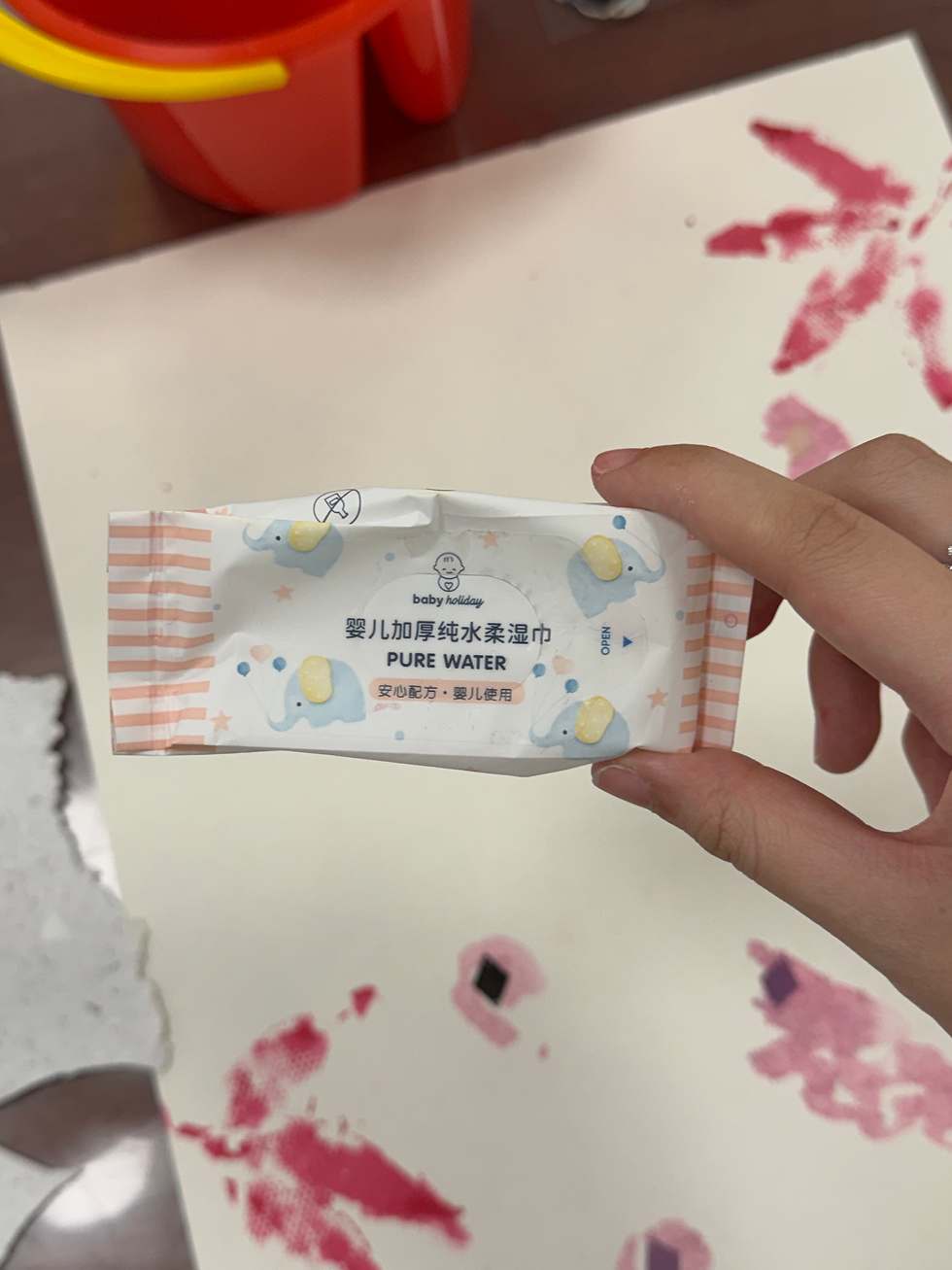
Things I used to paint


Drawing tools and process
Some small fragments could help me leave small areas of white space when coloring, which was my initial idea. However, when I was applying watercolor, I found that they would move as I pressed the brush down, so I only left a few white spaces. Although these white spaces disappeared in the end because I laid down a layer of blue grass!
The most important tool! When painting flowers, I wanted to simulate the circular spirals of Van Gogh's Starry Night 🌀. So I turned my usual wet wipes sideways, using the smaller, concave side as a brush. I dipped the brush in watercolor, pressed it onto the paper, and rotated it while painting. The spirals appeared! It was a novel experience; I never imagined I could simulate such irregular yet ideal patterns.
Another function of small fragments is to help extend thin lines. By using the edges of the fragments, I can move the colors that need to be extended without using a slightly thicker brush. Instead, I can use the edges to push the watercolor residue that is already on the canvas in the desired direction.
The leaves served to complement the surrounding elements of the composition. I wanted the image to appear more vibrant and natural, so I chose to paint the leaves themselves. While debating whether to use blue or pink, I remembered the 60/30/10 rule and opted for pink to unify the color of all the plants, presenting them as a cohesive whole.

Color Research
Magenta is often used in products aimed at young women, especially in beauty and fashion. Dior Lip Glow 781 is one example of how a vivid pink-red shade can create a bold and confident feminine image.
Magenta can also become part of a brand’s identity. Sometimes we recognise a brand through its color before seeing the whole logo.
At first, I simply connected magenta with femininity and beauty.
Then I started noticing how often it appears in fashion, makeup, toys and popular culture.
I began to question whether magenta is naturally feminine, or whether culture has taught us to read it this way.
Pink ~ Magenta ~ Red
soft ~ intense ~ passionate
When does pink stop feeling innocent?
More saturation = more visual tension
Magenta feels somewhere between sweetness and aggression.
Nature ~ flower / flamingo / dragon fruit
Culture ~ Barbie / fashion / beauty / anime
Near the butterfly/flower:
Magenta already exists in nature.
Near Dior:
Beauty turns color into desire.
Near the anime character:
Fantasy/identity/character design
Near the large magenta figure on the right:
The same color feels different when it occupies more space.
“Is magenta feminine by nature, or have we learned to see it that way?”

I collected many images of the magenta color and created a mood board and a small mind map. This helped me understand the use and scenarios in which this color appears.

Week 2

The photos were taken on the street opposite the school. Based on the photos, I raised questions about architecture, culture, and human interaction. I didn't interact with anyone on the street during this trip, but I had a novel idea: once you ask questions and share the answers, everyone knows something interesting. Therefore, setting aside your own identity and immersing yourself in the role of a worker is also a manifestation of leadership.

I watched a video about the AEIOU observation method, and I think it works well for impromptu speeches or casual conversations. For example, in a communication course, if we need to talk about a project and don't know what to say, we can start by focusing on the people, interactions, and environment of the project we studied.
My observations and questions: I need to improve my English skills because I found that there were some words I didn't know how to express when I wrote down my questions, such as religious items.


some of my notes about distribute things into AEIOU, but later I find everything include two or three in AEIOU.


Branding yourself through objects
The objects I use daily and the layout of the images reveal my personality and lifestyle.
My left hand is holding a lot of things, indicating that my life isn't simple, but rather needs a series of items to decorate it. You can see lipstick, coffee, a keychain, an exquisite necklace, and a designer bag—all conveying the message that I'm someone who loves seeking aesthetics in life.
The bracelet I'm wearing on my right hand also illustrates this. Furthermore, the bottle I'm holding in my right hand is pouring tears, and the bottle is inscribed with "boy's tear" and "100% nature." This reveals a side of me that's not widely known. I like to see the unstable side in emotional expression because, in the public's perception, boys crying is seen as weak. I pursue the unconventional, and these small, darker aspects sometimes become the strength and characteristics of a brand.


Tapestries Making

Design Process
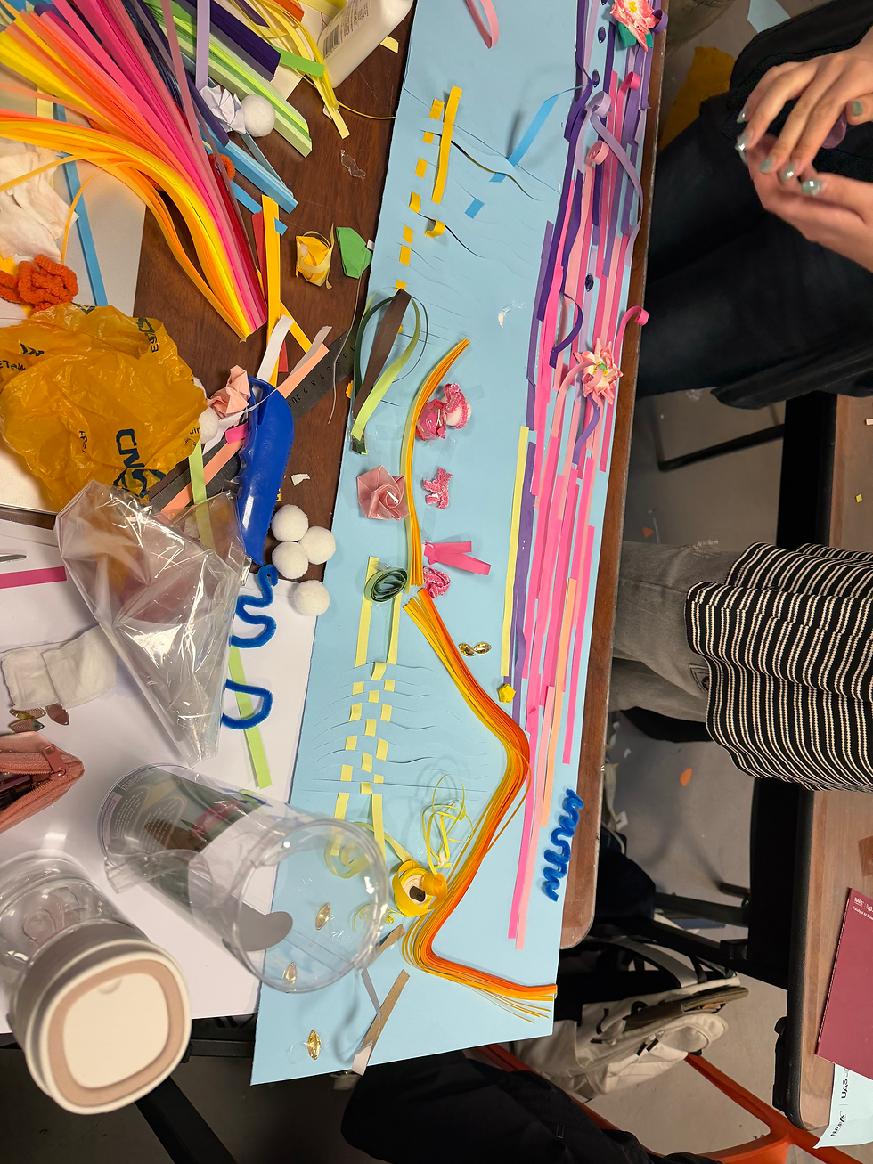
We decided to use blue as the background color because it can represent the sky. Our main theme is “Dream”, which gives us a lot of freedom to explore different colors. Because dreams do not have to follow reality, we can make the whole composition very colorful, imaginative and playful.
At the beginning, we planned to include elements from nature, such as flowers, butterflies and birds. We did not want to use realistic colors. For example, the stems of the flowers do not have to be green. We can freely combine different colors depending on the composition.
We also wanted to explore dimension and different materials. We bought small white balls and some clay. The clay can be shaped into flowers, fish or other forms, so we have more freedom when arranging the composition. Instead of keeping everything flat, some elements can come out from the surface and create more depth.
For another part, we prepared colorful paper and planned to cut and curl it into fringe-like shapes. The curled paper can create a sense of movement and lightness, making the work feel more alive. We also wanted to experiment with weaving, collage and folding, so different textures and techniques could exist together.
Our original plan was to work on the whole surface. However, during the process, we realised that we did not have enough time and the composition still felt too empty. So we decided to cut away half of it and focus on the remaining section. This allowed us to concentrate more on collage, weaving and folding, rather than trying to fill a large space.
The final direction was not decided from the beginning. It gradually changed as we tested the materials, looked at the empty spaces and considered the time we had. It became a process of experimenting, adjusting and making decisions through making, which I found very interesting.


Composition
&
Reflection

Because the final piece needs to be hung, I did not want the flowers and materials to become too crowded or visually heavy. I wanted at least part of the work to feel simple, light and breathable, so we started thinking more carefully about how the visual weight should move from top to bottom.
At the top, which feels like the lightest part of the composition, we decided to use more small pink and white flowers, together with a white frame and a sun-like decoration. The flowers here are smaller and lighter, so the top can still feel soft and airy.
In the middle, we used several larger paper flowers and clay flowers, but instead of filling the whole area, we intentionally left more white space around them. A few individual large flowers became the main focus. This helped us create contrast between detailed areas and empty areas, rather than making everything equally busy.
Towards the bottom, we started introducing more materials and techniques, including weaving, clay, pipe cleaners and small spring-like paper forms. We also created a gradual color transition. The flowers at the top are mainly pink and white, while the colors become deeper towards the bottom, moving into greyish purple tones. This connects the different sections while still giving each part its own feeling.
For the background, we covered most of the original blue surface with long strips of colored paper, but kept a small amount of light blue visible at the bottom. I liked this because the original background is not completely hidden—it still becomes part of the final work.
The bottom was something we thought about quite carefully. Since the piece is hanging, making the ending too dense or heavy would make the whole composition feel uncomfortable. So instead of adding too many large objects, we used pipe cleaners, curled strips and fringe-like elements to create movement. A few flowers were added at the very end to connect it back to the top.
Through this process, I realised that adding more does not always make a composition richer. Sometimes leaving space, changing the scale of the flowers, or using lighter materials can make the work feel more balanced. We gradually moved from small and light → larger and more structured → loose and flowing, which made the hanging piece feel more natural and less crowded.


Week 4

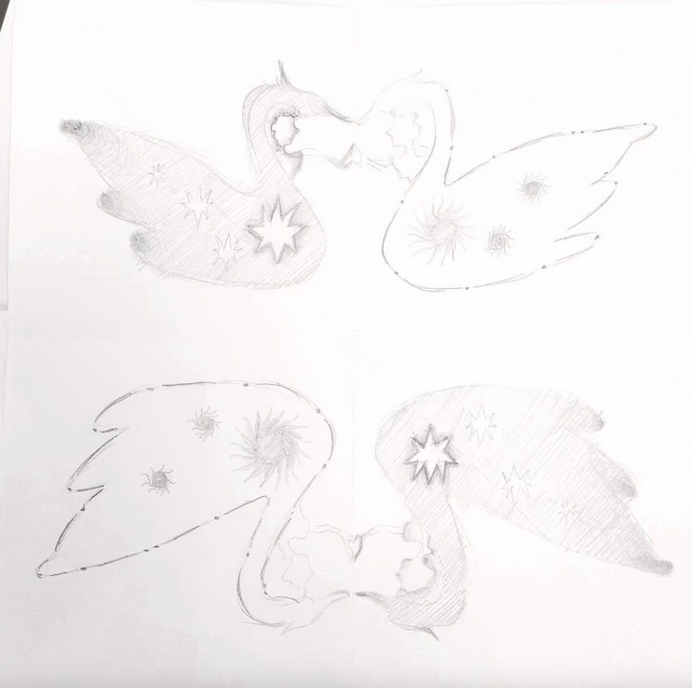
In week four, we learned about pattern design, the aesthetics of symmetry, and I started creating the pattern and chose a swan. The swans' beaks can connect, which I think makes for a nice, symmetrical design. I tried adding stars and sun elements to diversify the pattern. This is a swan with mythological and fantasy elements; I'm moving towards a Western fantasy style.
Later, I came up with the idea of incorporating human heads and hands to create a sense of connection between the swans. However, I decided not to place these elements between the two swans, as I thought it would look cumbersome. I could not picture what would go beneath the swans, other than something like lake water. Yet adding water would clutter the composition. So I focused on modifying the swans themselves.
I decided to add gradients to their wings. The white swan would not get wing gradients. Instead, I erased parts of its line‑art and added connection points to make it look more ornate and refined. For the black swan, I created gradient outlines around its six‑pointed star. Gradients were also applied to its body, feathers and beak. I further added gradients to the skin of the small human figures that touch one another beneath the swans.



Week 6

I used cutouts, masks, blending, and distortion options in my collage.
In Resilient Bodies, I learned how to overlay images onto a frame in the texture I want, achieving it through blending and distortion. For example, water and beaches. I used shading inside and glowing effects to shape a three-dimensional object.


proposal summary
BE SEEN is a 20-page A5 experimental book about a young woman entering the fashion industry and learning how to express herself.
The story follows her journey through six stages:
Silent - Notice - Speak - Too Loud - Simplify - Be Seen
At first, she is afraid to express her ideas. After receiving encouragement, she gradually becomes more confident and begins to find her voice. However, her desire to stand out eventually turns into excessive self-expression and blind following of trends. Through experience, she learns to simplify and find a balance between confidence and restraint.
Color Concept
Magenta represents her voice and confidence. Its intensity changes throughout the story:
Beginning: Minimal magenta, showing hesitation and insecurity.
Middle: Increasing magenta, representing confidence and expression.
Climax: Overwhelming magenta, reflecting excess and loss of control.
Ending: Balanced magenta with black, white, and softer tones, representing maturity and clarity.
Visual Direction
The book combines fashion photography, handmade illustrations, collage, typography, and geometric shapes. Materials such as transparent paper, torn-paper collage, and reflective textures help communicate the character’s emotional changes.
Final Message
The project explores the difference between being seen and constantly seeking attention.
True self-expression is not about being the loudest or occupying the most space. It is about understanding your identity and knowing when to express yourself.
Core idea: Being seen does not mean filling the whole frame. It means knowing how much space you truly need.


design idea
Finding the visual direction
Be Seen follows a young woman entering the fashion industry. At first, she is unsure of herself and afraid to speak up. After encouragement from a senior colleague, she begins to find her voice. As the industry changes, she starts following its louder trends and becomes more expressive than she intends. Through experience, she gradually finds a balance and learns to speak with confidence in her own way.
I wanted the colours to follow this change. Magenta became the main colour because it feels bold and immediately draws attention. I paired it with black to give it structure, then added warm cream to soften the contrast and keep the cover from feeling too heavy. Together, the colours move from quietness to intensity, then settle into a calmer balance.
I chose lilies as the main visual reference because they feel elegant and composed. Their long stems and open petals also suggest movement and resilience. I collected different lily images to explore how the flower could represent the main character: someone who faces difficulties while keeping her sense of self.
Developing the cover
My first arrangement included several lilies and a more decorative frame. As I developed the design, I felt that the flowers competed for attention. I reduced their number and arranged them to fall in a more consistent direction, giving the composition a clearer flow.
I also looked at different frame references. Some felt too ornate or too strong for the cover. I decided to draw a simpler edge of my own. Its irregular, rounded shape acts as a boundary around the magenta while leaving the colour as the main focus. I wanted it to feel like ink spreading across paper.
In the final cover, the flower, stems and lettering use curved lines that echo one another. These vine-like forms suggest the character’s gradual growth and her process of becoming visible. I kept the surrounding details quieter so the cover could feel expressive while still holding a sense of balance.